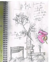
Feb 21, 2010
The Old Inn
Sketchbook 2


From left to right:
- Cu Sith (coo-shee): an interpretation I did of the Scottish dog for my novel. Watercolour pencil
- Snow Wolves: Misc. characters inspired by the cover shoot of Dazed and Confused #80 by Daniel Jackson. Lead and chinagraph pencils
- A drawing I did of the magazine cover mentioned above. It's done in highlighter and ink on tissue paper.
All images were drawn on pages from tea stained sketchbooks.
Young Australian Artist of the Year Award 2009

Anyway, Ochi got the overall drawing award (sponsored by the Lions Club). I used HB, 2B, 4B and 8B pencils/graphite on a piece of squared off A2 illustration board. It's this drawing that got me the job illustrating Gary Crew's picture book but more on that as it happens. The drawing's behind glass now so this is the best image I have of him for now. Ochi is actually a rhythm (how your eye travels around an image) experiment, so he did well. He's also a character from one of my novels (yes I am a writer too).

As a kind of compromise 'The Cabinet' (above) got the cover of the ASG (Australian Scholarship Group) magazine that it gives to the artists/writers attending and sends out to the schools. The Cabinet was supposed to win the overall award and was my Yr 11 final piece. Painted on A1 300gsm watercolour paper in watered down acrylic.

'Bludgerfawn' was supposed to win best painting. He's painted on A2 in watered down acrylic using only two colours: black and yellow oxide for his eye. Bludger has now become the character for one of my kids stories but originally was an experiment on using soft and sharp lines to give a 3D effect. if you look at him from a distance his hands look closer than his head. He IS a badger despite what people say and his hands are not chained together, he is holding a pocket watch.
Bludger wasn't included in the magazine but a print was silently auctioned for $400. On top of that, prints of both the Cabinet and Ochi were raffled and together raised about $1200. All of the prints I had donated and the money went straight to the CCN (Children's Charity Network) which are the guys who run the event.
I was sitting on a table with Marc McBride and Doug MacLeod. They are some of the funniest people I have ever met. My poor mother was left in a corner while I socialised.
The YAAWA are open to school-aged children. Google the name or go to http://www.youngatart.com.au/ for info on the art awards. there is a website for the writing portion somewhere...
How to Paint Little Red

This is Red's line work. A stock reference was used for the face but the rest was made up. It was drawn directly onto the paper I painted onto.

The skin was layered with washes of pthalo green and the layering of gold was started on the face. The rest of her skin was then layered with gold.
Layered red over the hair, lips, eye and limited parts of the skin.
Black was layered over the areas of red and later the green. This process was repeated with the green and red for her 'clothes'.
I went back and reworked the chin before washing in the background with a yellow and pthalo green. This painting process is basically how all of my paintings using watered down acrylics are done just with different colours.
Little Red
 This is another experiment, although this time exploring analogous colours (opposite on the colour wheel) which in this case are green and red. She was painted sometime in mid '09 on A2 watercolour paper in watered-down acrylic and is the first face I have ever painted. Also she got a high commendation in the Shaun Tan Art Awards 2009.
Wrenna
Feb 17, 2010
Sketchbook


